Restaurant Menu Photography: The Operator’s Guide to Shoot, Enhance, and Publish
Menu photos are the part of your restaurant most customers see before anything else, which makes restaurant menu photography one of the highest-leverage systems an operator can build. The goal is not a glossy portfolio. It is a repeatable workflow that turns dishes into clear, consistent, menu-ready images you can publish across delivery apps, your website, and social without rework. This is the operator’s version: what to shoot, how to keep it consistent, and how to ship it.
The fast version
- Photograph the items that drive orders first: top sellers plus high-margin dishes.
- Use one consistent setup so the menu looks like a single brand.
- Export the right crop for each platform so photos never look blurry or awkward.
Step 1: Decide what to shoot so you actually finish
The fastest way to stall a menu photo project is trying to shoot everything. You do not need photos for every modifier. Prioritize in this order:
- Top sellers, because they get the most views and orders.
- Signature items that define your brand.
- New items and specials, which need photos to launch well.
- High-margin items you want to push.
Knock out that list and you have covered the dishes that move revenue. Everything else can wait for a later sprint.
Step 2: The photo station you keep all week
Consistency beats perfection, and the easiest way to get consistency is to build a station once and leave it up. You need very little:
- Side window light for soft, flattering, texture-revealing light.
- A neutral background that does not compete with the food.
- A white foam-board reflector to lift shadows on the dark side.
Avoid mixing daylight with yellow overhead kitchen lights, because color drifts from dish to dish and the menu stops looking unified. If your space is tight, our tight-kitchen photo station setup shows how to do this in 10 minutes.
Step 3: A shot list that works across platforms
Standardize a short list so each dish goes fast and the results stay consistent:
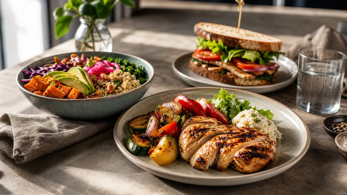
- 45-degree default for most plated dishes. It is the most versatile restaurant angle.
- Overhead for bowls, salads, pizzas, and platters, where a top-down read is clearest.
- Close texture for crispy edges, glossy sauce, melt, or steam. This frame carries social and promos.
Three frames per dish is plenty for menus, delivery thumbnails, and social. For a full team-ready standard, pair this with our restaurant photo style guide.
Step 4: Enhance, export, and publish
This is where most kitchens lose quality, because a phone struggles with mixed lighting, color casts, and busy backgrounds. The honest workflow:
- Pick the sharpest frame from each dish.
- Enhance lighting and clean the background without changing the food. This is exactly what FoodPhoto.ai does: it corrects light, color, gloss, and background on a real photo of your real dish, so a phone shot ends up looking studio-grade for a few cents instead of a few hundred dollars.
- Export the right crops for delivery apps and the sizes you need for web and social.
- Upload and review as thumbnails, since that is the size most ordering decisions happen at.
Keep one high-quality master photo per dish and export crops from it rather than re-shooting for each platform. That single habit removes most of the rework that makes menu photography feel like a chore.
How many photos do you actually need?
A common reason menu photography stalls is scope. You do not need a photo of every modifier, sauce option, or size. A practical target for most independent restaurants:
- Every top seller and signature dish: a non-negotiable. These drive the most views and orders.
- Every special or new item, at launch: an item without a photo converts worse, so shoot it as part of launching it.
- High-margin items you want to push: photos shift demand toward the dishes that make you money.
- Category anchors: at least one strong photo per menu section so no part of the menu looks empty.
That is usually 15 to 30 dishes, not the entire menu. Cover that set first and you have captured the images that actually influence ordering decisions. Everything else can fill in over later weekly sprints.
What makes a menu photo "convert"
A converting menu photo is not the most artistic one. It is the clearest one. Three properties matter most:
- Readable at thumbnail size. Most ordering happens on a phone, where your photo is small. If the dish is not instantly recognizable when shrunk, the crop is wrong.
- Accurate to the real dish. The photo should match the portion, plating, and color a customer actually receives. Honest photos build trust; exaggerated ones generate disappointment and refunds.
- Consistent with its neighbors. A dish that is brighter, darker, or shot on a different surface than the rest of the menu reads as inconsistent, and inconsistency reads as uncertainty.
Optimize for those three and the photo will do its job across delivery apps, your website, and search.
One master, three destinations
The reason a single high-quality master photo per dish is worth the discipline is that each place you publish wants a slightly different crop from the same image. Plan the master loose enough to feed all three:
| Destination | Crop you export | What it rewards |
|---|---|---|
| Delivery apps | Near-square thumbnail, food centered | Instant readability at tiny size; survives auto-crop |
| Website / digital menu | Wider or 4:3, a touch more context | Room for the dish to breathe alongside copy and price |
| Social (feed + stories) | Square and vertical | A tighter, more dramatic frame of the hero element |
Capture once with safe margins, then cut each crop from that frame instead of reshooting. The delivery thumbnail is the strictest test, so if you frame for it you usually have room for the others. Our delivery platform image optimization checklist covers the export side in detail, and the restaurant menu image SEO guide covers naming and alt text so those same photos also get found in search.
Keeping the menu fresh
A menu is never "done." Specials rotate, prices change, and stale photos quietly drag down conversion. The fix is cadence, not heroics. A short weekly loop keeps your top sellers and specials current without a big production. Our weekly restaurant photo sprint lays out a 60-minute system you can run with the station above.
Common mistakes to avoid
- Loose crops that turn a great dish into a tiny, unreadable thumbnail. Crop tighter and run the zoom-out test.
- Yellow or green color casts from overhead lights, which make fresh food look stale.
- Cluttered backgrounds that pull attention off the dish.
- Inconsistent angles and surfaces that make the menu feel unreliable.
- Over-editing that changes what you actually serve and erodes trust when the food arrives.
Good menu photography is a system, not a one-time shoot. Build the station, lock the shot list, enhance honestly, and ship on a weekly cadence, and your menu will start selling for you across every channel. When you are ready to standardize the whole menu, see pricing.
Frequently asked questions
Which menu items should I photograph first?
Start with the items that drive orders and margin: top sellers, signature dishes, new items and specials, and high-margin items you want to push. You do not need a photo for every modifier. Covering the dishes that actually influence ordering decisions gets you most of the upside quickly.
What is the simplest setup for consistent menu photography?
One spot with side window light, one neutral background, and a white foam-board reflector. Keeping the same setup all week is what makes the menu look like one brand. Consistency beats perfection, and a fixed station removes the decisions that slow a shoot down.
What shots do I need for each dish?
A 45-degree default for most dishes, an overhead for bowls, salads, pizzas, and platters, and one close texture frame for crispy edges, sauce, or steam. That small shot list covers menu listings, delivery thumbnails, and social without overproducing.
How do I avoid blurry or badly cropped menu photos on delivery apps?
Keep one high-quality master photo and export the right crop for each platform instead of uploading a single crop everywhere. Always review the result at thumbnail size before publishing, since that is where loose crops and soft focus get exposed.