The Restaurant Photo Style Guide: Make Every Menu Photo Look Like One Brand
Most restaurant photo problems are not bad photos. They are inconsistent photos. One dish is bright, one is yellow, one is dark, and one was clearly shot on a different table. Customers feel that inconsistency as uncertainty, and uncertainty slows orders. A restaurant photo style guide fixes this by locking the handful of decisions that make every menu photo look like one brand. This is a practical template you can copy today, whether you run a single location, a ghost kitchen, or a multi-location brand.
The fast version
- Pick one visual style that fits your brand and price point.
- Lock three standards: background, light direction, default angle.
- Write a one-page spec so any staff member can follow it.
- Use a short QC checklist before publishing.
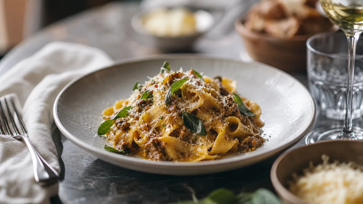
Step 1: Pick the style that matches your business
Style is a positioning choice, not just an aesthetic one. Here are the common restaurant styles and what they signal:
- Bright and clean signals fresh, fast, healthy, and modern. Works for bowls, cafes, salads, Mediterranean, and smoothies.
- Dark and moody signals premium, indulgent, and craft. Works for burgers, steak, cocktails, and desserts.
- Minimal studio (clean background, simple props) signals clarity and professionalism. Works for delivery-first menus and large catalogs.
- Lifestyle (context, hands, environment) signals experience and hospitality. Works for dine-in and higher price points.
A useful rule of thumb: delivery menus want clarity, so minimal studio works extremely well, while social wants story, so lifestyle and action shots shine once the core menu is clean. For the looks themselves, our 2026 style trends guide breaks down clean-bright, warm-premium, and moody-upscale in detail.
Step 2: Define your three non-negotiables
If you standardize only three things, standardize these.
Background
Pick one main background and one backup, such as a light neutral, light wood, or matte black for moody concepts. Keep the corners clutter-free.
Light direction
Pick one: side window light (easiest and most flattering) or a controlled continuous light (more consistent across days and seasons). Avoid mixed overhead kitchen lighting whenever possible, because it shifts color from dish to dish.
Default angle
Pick a default angle for menu listings. 45 degrees is the most versatile for restaurants. Use overhead as a secondary angle for bowls, salads, pizzas, and platters; our flat-lay guide covers when overhead wins.
Step 3: The one-page style spec (copy and paste)
Put this in a shared doc and give it to anyone who shoots.
1. Goal. Menu photos should look [bright and clean / dark and premium / minimal studio]. Photos must be accurate to the delivered dish.
2. Background. Primary background, backup background, no clutter in corners.
3. Lighting. Light source, light direction, reflector, overhead kitchen lights on or off.
4. Angles. Default angle for menu items, overhead rules, close-up rules.
5. Framing. Keep the plate fully visible, center the hero ingredient, leave breathing room for crops.
6. Styling. Clean plate edges, garnish last, portions must match real orders.
7. Editing. Fix exposure and color, clean the background, never change ingredients or portions.
8. Exports. Export platform crops for delivery apps, a square for social, and confirm thumbnail readability before uploading.
Step 4: Build a simple station kit
Consistency comes from removing decisions. Keep a small, fixed kit: one background surface, a white foam-board reflector, a microfiber cloth for plates and the lens, and one optional brand prop used every time. If you have multiple locations, standardize the kit so every store can match the look.
Step 5: Train the team so it survives past week one
Most teams fail because the process is too complex. Make it teachable with one setup, one shot list, and one checklist. A simple training plan works well: a 10-minute demo of the station and angles, 10 minutes shooting one dish together, and a 5-minute QC pass comparing the result to the spec and fixing errors.
Step 6: The QC checklist before you publish
Reshoot or pick a different frame if any item fails:
- Reads clearly as a thumbnail.
- Accurate color with no yellow cast.
- Clean background and clean plate edges.
- Consistent with the rest of the menu.
- Hero ingredient centered and crop-safe.
Common style-guide mistakes that quietly break consistency
Even teams with a spec drift over time. Watch for these:
- Changing the background "just this once." One dish shot on a different surface stands out immediately in a grid and makes the whole menu feel unplanned.
- Letting overhead lights creep back in. When the window is dark, staff reach for the kitchen lights, and color shifts warm. Either wait for daylight, use one controlled light, or correct it in enhancement.
- Over-garnishing for the photo. If the plate in the photo has more herbs, sauce, or portion than the plate a customer receives, you create disappointment and refund risk. Photos must match the delivered dish.
- Inconsistent crops across platforms. A square that works on social gets the hero ingredient sliced on a delivery thumbnail. Export the right crop per channel from one master.
- Skipping the QC pass when it’s busy. This is when the worst photos slip through. The five-point checklist takes 20 seconds per image.
A style guide is only as strong as the discipline behind it. The point of writing it down is so the standard does not depend on whoever happens to be shooting that day.
How the style guide pays off
Consistency is not a vanity exercise. A unified menu reads as a single confident brand, which makes every price easier to accept because customers can clearly picture what they are buying. It also compounds across channels: the same standard that makes your delivery-app menu look premium makes your Google Business Profile, your website, and your social feed look like they belong to the same restaurant. Our 2026 food photography trends make the same point from the trend side: in 2026, the restaurants that look premium are the ones with a system, not the ones chasing a new aesthetic every season.
Step 7: Scale across brands and locations
If you run multiple brands or stores, give each brand its own background and prop rule, keep angles and lighting consistent across all of them, and publish using the same export sizes every time. The hard part of consistency at scale is that lighting and skill vary by location and by day. This is where honest enhancement helps: FoodPhoto.ai takes a real photo of a real dish and standardizes lighting, background, and color to a single look without changing the food, so a busy line cook with a phone can hit the same standard as your best shooter. That keeps every location on-style without booking constant shoots.
A style guide is not about making any one photo perfect. It is about making your whole menu feel like one confident brand. Define the spec once, enhance to it consistently, and your menu will start converting like the premium concept it already is. When you are ready to standardize across the menu, see pricing.
Frequently asked questions
What is a restaurant photo style guide?
It is a one-page spec that locks the few decisions that make menu photos look consistent: the visual style, the background, the light direction, the default angle, and the crop rules. Anyone on your team can follow it to produce photos that look like one brand instead of a dozen different rooms.
Why does consistency matter more than having beautiful photos?
Customers read inconsistency as uncertainty, and uncertainty slows orders. When one dish is bright, one is yellow, and one is dark, the menu feels unreliable. A unified look signals quality control and makes every price easier to accept, even if no single photo is a magazine cover.
What three things should I standardize first?
Background, light direction, and default angle. If you fix only those three, your menu will immediately look more cohesive. A neutral background, consistent side light, and a 45-degree default angle handle the majority of restaurant dishes.
How do I keep multiple locations on-brand without constant shoots?
Give every location the same one-page spec, the same simple station kit, and the same export sizes. Then standardize the look itself so enhanced photos stay on-style automatically rather than depending on each location's lighting and skill.