Menu Photo Composition: The 6 Rules That Make Food Look “Orderable”
Composition sounds like an art-school word, but for restaurant menus it’s something far more practical: food photography composition is how you make a dish easy to choose on a phone. A diner scrolling a delivery app or a menu page spends a fraction of a second per item. Good framing reduces the work of deciding — it makes the dish look clear, premium, and "orderable." These are the six rules that do most of that work, no artistic talent required.
You don’t need to be creative. You need to be consistent and follow a short checklist.
Rule 1: Fill the frame
This is the rule that fixes the most photos. On a thumbnail, the food should occupy roughly 60-80% of the image. Distant shots with a small plate floating in empty space read as amateur and make the dish hard to evaluate.
- Move closer with your body, not digital zoom.
- Crop tight enough that the viewer can almost taste it.
- Leave just a little breathing room so delivery apps and social can crop without cutting into the food.
If you remember only one rule, remember this one.
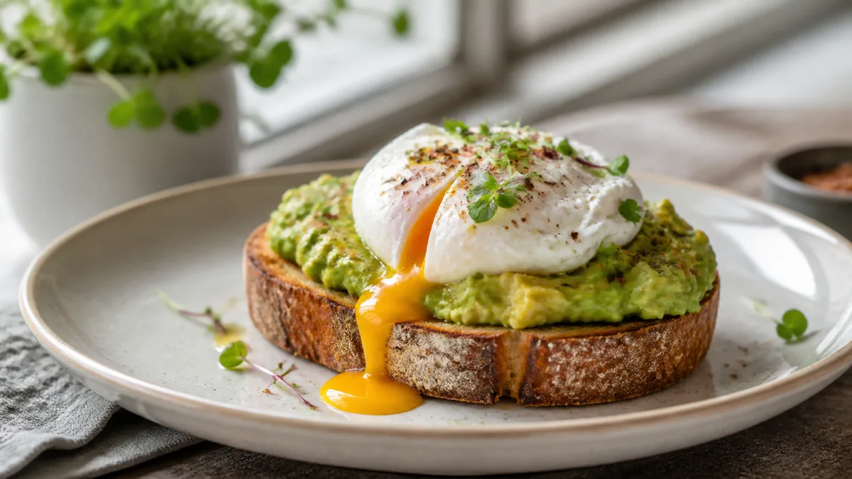
Rule 2: Match the angle to the dish
There’s no single best angle — there’s a best angle per dish type:
| Dish type | Best angle | Why |
|---|---|---|
| Flat (pizza, salads, soup) | Overhead (90°) | Shows the full surface and pattern |
| Tall (burgers, stacks, layered desserts) | Eye level to 30° | Shows height and layers |
| Bowls (ramen, poke) | 30-45° | Shows surface and depth |
| Plated entrées | 30-45° | The most natural, versatile angle |
| Drinks | Eye level or slight down | Shows glass shape and color |
Shoot the wrong angle and even a great dish looks off. For drink-specific framing, see our phone drink and cocktail guide.
Rule 3: Use the rule of thirds (or center on purpose)
Turn on your camera’s grid. Place the hero element — the most appetizing part of the dish — on one of the four points where the lines cross, rather than dead center. Off-center placement feels intentional and gives the eye somewhere to land.
Centering is fine, but only for symmetrical dishes shot straight down: a round pizza, a bowl of soup, a perfectly plated tart. For everything else, the thirds grid gives a more premium result.
Rule 4: Build depth so the photo isn’t flat
Flat photos look like documentation; layered photos look like food you want. Create depth by:
- Placing the hero dish in front and supporting elements slightly behind.
- Using your phone’s portrait or food mode to softly blur the background.
- Letting a napkin edge, utensil handle, or board edge act as a leading line toward the food.
A little depth separates the dish from its surroundings and makes it pop on a busy delivery grid.
Rule 5: Control negative space
Empty space isn’t wasted — it’s a tool. Intentional space above or beside the dish does two jobs:
- It gives the image room to breathe so the food feels premium rather than cramped.
- It gives you a place for text overlays on social, and gives platforms room to crop without hitting the food.
The trick is intentional space, not an accidental sea of empty table. Frame the gap on purpose.
Rule 6: Keep the background clean and on-brand
The background should support the food, never compete with it.
- One neutral surface: wood for warmth, stone or white for clean, dark slate for drama.
- No busy tablecloths, patterned plates, or visible kitchen clutter.
- The same background across your menu so the whole listing reads as one brand.
Consistency here is what makes a self-shot menu look professionally produced. For applying a single style across many dishes and brands, see the ghost kitchen branding playbook.
Common composition mistakes (and the quick fix)
Most weak menu photos fail on the same handful of issues. Run through this list before you publish:
- The dish is too small and too far away. The fix is Rule 1 — move in and crop tight. A small plate floating in a big frame is the number-one reason a photo reads as amateur.
- The angle fights the dish. A burger shot from directly overhead loses all its height; a pizza shot from the side hides the toppings. Match the angle to the food, not your habit.
- The background is doing too much. A patterned tablecloth or a glimpse of the prep line steals attention. One clean surface, every time.
- Everything is dead center and flat. Centering only works for symmetrical, top-down dishes. For the rest, nudge the hero onto a thirds point and add a touch of depth.
- Tilted horizon or liquid line. A crooked table edge or a slanted soup surface looks careless. Straighten it in the crop.
- No room to crop. If the food touches all four edges, delivery apps and social will cut into it. Leave a small, intentional margin.
None of these require talent — just a five-second look at the frame before you tap the shutter.
Composition for the thumbnail, not the wall
Here’s the mental shift that matters most for restaurants: you’re not composing for a gallery print, you’re composing for a postage-stamp thumbnail on a delivery app, sandwiched between a dozen competitors. That changes the rules in practical ways.
Detail that looks subtle at full size disappears at thumbnail scale, so your composition has to lead with one obvious, appetizing element — the cheese pull, the glossy glaze, the char. Fine garnish and delicate plating are lost; bold shape and color survive. Before you commit to a frame, shrink the photo on your phone to roughly the size it’ll appear in the app. If you can’t instantly tell what the dish is and why you’d want it, the composition is too busy or too distant. This single test catches more problems than any rule above, and it’s why our delivery app thumbnail playbook treats small-size legibility as the real goal of menu photography.
Putting the rules together
You don’t apply these one at a time in your head during a busy service — you bake them into a setup. Lock your angle and background, turn on the grid, fill the frame, add a touch of depth, and frame your negative space on purpose. Do that the same way every time and your menu photos become consistent and clearly "orderable."
If you want a repeatable place to apply all six rules at once, build a fixed restaurant photo station for a tight kitchen — a corner where the angle, background, and light are already decided so composition becomes muscle memory instead of a decision per dish.
Where AI enhancement helps composition
Capture is where composition is won, but enhancement can rescue framing. If a shot is well-angled but the background is cluttered or the crop is loose, FoodPhoto.ai cleans the background, balances the lighting, and crops tighter to spec — without changing the food. It enhances the real dish you photographed, so it sharpens a good composition rather than inventing a fake one. Try it on one photo in the Menu Test Pack.
Good composition plus honest enhancement is the fastest path to a menu that looks expensive. When you’re ready to apply it across your whole menu, FoodPhoto.ai pricing starts at ten photos for $10 with plans from $15/month — credits roll over, cancel anytime.
Frequently asked questions
What is the most important composition rule for menu photos?
Fill the frame. On a phone-sized thumbnail, the food needs to take up most of the image so it reads instantly. Distant shots with lots of empty space are the single most common reason menu photos look weak.
Should menu photos be shot overhead or at an angle?
Match the angle to the dish. Flat foods like pizza, salads, and bowls of soup look best overhead. Tall items like burgers and stacked dishes look best at eye level or a slight downward angle. Plated entrées and bowls work well at 30-45 degrees.
Does composition really affect how many people order?
Yes. Clear, well-framed photos make a dish easy to evaluate at a glance, which lowers hesitation and improves taps and orders on delivery apps and menus. Composition is about reducing the work of choosing.
Can AI fix the composition of a food photo I already took?
AI enhancement can clean the background, fix lighting, and crop more tightly to improve framing, but it works best on a photo that’s already reasonably composed. FoodPhoto.ai enhances the real dish without changing the food, so good capture still matters.