Best Food Photography Styles for Social Media (2026): Pick One and Stick to It
The most common food photography mistake on social media isn’t bad lighting — it’s an inconsistent feed. The best food photography style for your social media is the one you pick and apply everywhere, because in 2026 a recognizable, coherent feed signals quality and price point faster than any single beautiful photo. This guide covers the five styles that actually work for restaurants and how to choose one and stay consistent.
Style is a business decision, not just an aesthetic one. It tells customers what kind of place you are and roughly what to expect to pay before they read a word.
Why consistency beats variety
Scroll a grid of a restaurant’s posts and your brain answers one question in under a second: does this place look like it knows what it’s doing? A consistent style answers "yes." A feed where every post has a different background, light, and mood answers "not sure" — and "not sure" loses to a competitor who looks dialed in.
Consistency is what makes nine separate photos read as one brand. That’s why locking your look matters more than chasing variety: it compounds. Every consistent post reinforces the last one.
Five food photography styles that work for restaurants
Each style fits certain menus and brand positions better than others. Here’s how to match them:
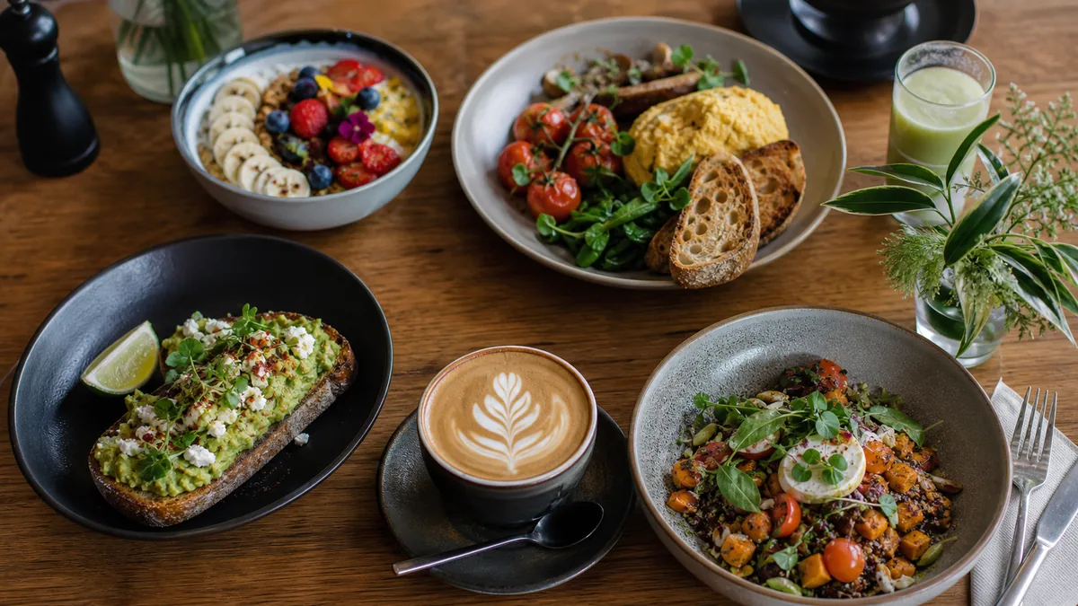
Bright & clean
High-key, lots of light, crisp whites and fresh greens. Best for salads, grain bowls, cafés, brunch spots, and any brand built on "fresh." It reads healthy, approachable, and modern, and it performs well as delivery-app thumbnails because it’s legible at small sizes.
Dark & moody
Low-key lighting, deep shadows, rich color, dramatic side light. Best for burgers, steaks, cocktails, and premium or evening-focused brands. It signals indulgence and a higher price point. Use it deliberately — moody done badly just looks underexposed.
Minimal studio
Simple background, even light, dish front and center, no clutter. Best for delivery-first menus where the photo has one job: be a clear, clean thumbnail. This is the safest default if you sell mostly through DoorDash and Uber Eats.
Lifestyle
Food in context — hands, tables, a hint of the room, natural moments. Best for dine-in experience and brand storytelling. It builds an emotional connection but is harder to keep consistent, so use it as a supporting style rather than your menu standard.
Action
Motion captured mid-moment: a syrup drizzle, a cheese pull, a cocktail pour, a pull-apart. Best for Reels and short video, where movement stops the scroll. This is the one secondary style most restaurants can layer on top of a clean primary look.
How to choose your style in three questions
- What does your menu lead with? Fresh and light → bright & clean. Rich and indulgent → dark & moody. Mostly delivery → minimal studio.
- What price point are you signaling? Premium positions lean darker and more editorial; value and fast-casual lean brighter and simpler.
- Where do customers see you most? Delivery-app thumbnails reward minimal clarity; an Instagram-led brand can afford more lifestyle and action.
Pick one primary style from your answers. Allow at most one secondary style (usually action for video). Then commit.
How to stay consistent (the part that actually matters)
Choosing a style is easy. Holding it across hundreds of posts and a rotating staff is the hard part. Three rules keep you locked in:
- Keep the same lighting setup. One light direction, one background. This single decision drives most of your consistency.
- Keep the same default angle for menu shots — pick a 45° or top-down standard and stick to it.
- Keep the same crop sizes per platform so every post sits cleanly in the grid and survives delivery-app crops.
Write these down as a one-page style guide so it doesn’t live only in your head. For the full operator version, see our framework on the restaurant photo style guide approach to making every photo look like one brand, and build the habit with a repeatable weekly photo sprint.
A quick comparison: which style for which brand
If you only remember one table from this guide, make it this one. It maps each style to the menu and price point it serves best, plus where it tends to break down.
| Style | Best for | Price signal | Watch out for |
|---|---|---|---|
| Bright & clean | Salads, bowls, cafés, brunch, juice bars | Value to mid | Can look sterile if the light is too flat |
| Dark & moody | Burgers, steaks, BBQ, cocktails, dinner | Premium | Underexposure that just looks like a mistake |
| Minimal studio | Delivery-first menus, mixed catalogs | Neutral | Bland if the dish itself isn’t well-styled |
| Lifestyle | Dine-in, brand storytelling, events | Mid to premium | Hard to keep consistent across many shots |
| Action | Reels, short video, hero moments | Any | Distracting if overused on static menu shots |
Use it as a starting point, not a rulebook. A fast-casual taco brand can run bright & clean and still drop the occasional action shot of a cheese pull for video. The point is to choose a dominant column and treat everything else as an exception.
Common mistakes that quietly break a feed
Even restaurants that pick a style often sabotage it without realizing. The usual culprits:
- Switching backgrounds mid-feed. A wood board on Monday, marble on Wednesday, a metal tray on Friday. Three surfaces read as three restaurants.
- Letting the time of day pick your light. A photo shot at noon by a window and another shot at 7pm under kitchen fluorescents will never match, even of the same dish.
- Over-filtering some posts and not others. A heavy preset on one shot and a raw phone photo on the next destroys the family resemblance.
- Chasing trends. A new aesthetic every few weeks looks busy, not current. Pick your look and let it age into a recognizable brand.
- Forgetting the thumbnail. A moody, shadow-heavy shot can look stunning full screen and turn into an unreadable dark square at delivery-app tile size. Always check the small version.
The fix for every one of these is the same: one written setup, one default angle, one enhancement step that pulls drift back into line.
Platform-specific notes
Your chosen style stays the same, but how you deploy it shifts by surface:
- Instagram grid: This is where consistency pays off most, because people see nine posts at once. Plan in rows of three and keep the look uniform across them.
- Reels and TikTok: Your secondary action style lives here. Movement earns the watch, but keep the same color grade so video and grid still feel related.
- Delivery apps (DoorDash, Uber Eats): Lean toward your cleanest, most legible version. Tiles are tiny, so minimal and bright tends to out-convert moody and busy.
- Google Business Profile: Steady, accurate, well-lit photos read as "open and active." This isn’t the place for experimental looks. See our Google Business Profile photo strategy for how style and freshness feed local results.
Where enhancement fits
Even with a fixed setup, real-world conditions drift — staff change, light shifts through the day, a phone meters differently. A consistent enhancement step is what pulls everything back to your chosen style: matching brightness, color temperature, and background cleanliness across every photo so a Tuesday lunch shot and a Friday dinner shot belong to the same feed.
FoodPhoto.ai is built for exactly this. Upload a real phone photo of your real dish, apply your chosen look, and get a consistent, menu-ready image without changing the food. It’s the fastest way to make a feed shot by different people on different days still read as one brand. Try it on a recent post in the Menu Test Pack.
A quick consistency audit
Open your last nine posts in a 3×3 grid and ask:
- Do the backgrounds match, or is every dish on a different surface?
- Is the lighting direction the same, or does it jump around?
- Are the colors and brightness in the same family?
- Could a stranger tell these are all from the same restaurant?
If the answer to the last one is "not really," you don’t need a new camera — you need a chosen style and a consistent enhancement step. Pick one look from this guide, lock your setup, and let consistency do the branding. When you’re ready to make every post match without extra work, see pricing and start with your next nine posts.
Enhance your real food photos in FoodPhoto.ai
FAQ
What’s the best food photography style for social media?
There’s no single best style — there’s the best style for your brand. Bright and clean suits fresh, healthy menus; dark and moody suits premium burgers, steaks, and cocktails; minimal studio suits delivery-first brands. The key is to pick one and apply it consistently so your feed reads as one recognizable brand.
Why does consistency matter more than variety on social?
A consistent style signals quality and price point and makes your feed instantly recognizable in a crowded grid. Variety scatters that signal — customers can’t tell what to expect. Locking one background, one light direction, and one default angle does more for your brand than constantly switching looks.
How do I keep my food photos consistent across posts?
Use the same lighting setup, the same default angle for menu shots, and the same crop sizes per platform. Write a one-page style guide and run a consistent enhancement step so color, brightness, and background match across every post.
Can I use more than one food photography style?
Pick one primary style for your menu and feed, then allow a single secondary style for a specific purpose — for example, action shots for Reels. The rule is one dominant look so the brand stays coherent, with intentional exceptions rather than random variety.