Food Photography Style Trends 2026: Looks, Lighting, and Composition That Read Premium
The food photography trends that matter in 2026 are thumbnail-first composition, honest AI enhancement of real dish photos, menu-wide visual consistency, delivery-safe exports, and faster refresh cycles. Restaurants should avoid fantasy AI dishes and edits that change portions or ingredients, because trust now matters as much as polish.
This answer-first summary is added for search and answer engines; the full guide below explains the style choices, lighting patterns, delivery crops, and restaurant workflow in detail.
Every year, "food photography trends" gets translated into one expensive mistake: "Let's change our style again." For restaurants, that usually backfires. The real food photography trends in 2026 are not about chasing new aesthetics. They are about choosing one signature look and applying it consistently so your menu reads like a single brand. This is the style layer: the lighting moods, composition rules, and three looks that read premium in 2026, plus how to implement them without turning your kitchen into a studio.
The fast version
- The biggest trend is thumbnail-first composition: tight crops, a clear hero ingredient, minimal clutter.
- The second is consistency: fixed backgrounds, angles, and crops across the whole menu.
- Realism is back. Over-edited, fake-looking food loses trust and orders.
- Multi-format exports are mandatory, because delivery, web, and social all crop differently.
- A weekly photo sprint beats occasional big shoots for almost every restaurant.
The trend behind all trends: restaurants are content producers now
The old model was to book a shoot, get 20 photos, and use them for months. The 2026 model is to shoot continuously, enhance and standardize, and publish everywhere. Menus change, delivery is a feed, and customers compare you visually before they order. So when you read "trends," translate every one into a single question: does this make my restaurant easier to choose?
The 2026 scoreboard
Most "trends" do not move revenue. These do.
| Trend | Why it matters | Do this week |
|---|---|---|
| Thumbnail-first composition | Wins the scroll on delivery apps | Re-crop your top 10 items tighter |
| Consistency systems | Builds trust across the menu | Lock 2 backgrounds and 2 angles |
| Realism and trust | Reduces hesitation and complaints | Dial back over-editing |
| Multi-format exports | Prevents bad crops and rework | Export delivery, web, and social |
| Texture lighting | Makes food look edible | Add side light plus a bounce card |
| Proof frames | Increases delivery trust | Add packaging and portion shots |
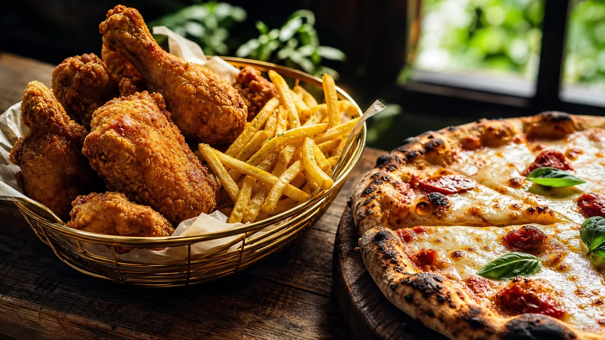
Trend 1: Thumbnail-first composition
This is the trend that pays back fastest. Customers scroll quickly, and your dish competes with other restaurants, the "popular" carousel, and discount bundles. Your job is to be instantly readable. In 2026 that means the dish fills roughly 70% of the frame, the hero ingredient is centered, the background is clean, texture is visible, and color is realistic rather than neon or gray.
The fix is simple: pick your top 10 items, run the thumbnail test (zoom out until the image is tiny), and crop tighter wherever the dish becomes unclear. Restaurants that shoot "for Instagram" leave too much table, and on a delivery app that becomes a tiny dish in a big frame.
Trend 2: Consistency systems over random variety
Premium restaurants look like they have a system, and consistency reads as trust. When your menu photos feel unified, customers assume quality control exists and the dishes will match expectations. Build a brand pack once: two backgrounds, two or three angles, one mood, and one crop rule per platform. Then stop changing it every week. Our restaurant photo style guide is the template for locking this down across a team.
Trend 3: Realism and trust (the anti-fake trend)
People are more aware of AI and heavy editing than ever. That does not mean you cannot enhance; it means you should enhance for clarity, consistency, and accurate color, not to change the dish. The realism rule: do not use editing to change the food, use it to show the food clearly. This is exactly the honest-enhancement approach behind FoodPhoto.ai, which fixes lighting, background, and color on a real photo of your real dish without inventing anything.
Trend 4: Multi-format exports become standard
One photo now needs to work in delivery thumbnails, website menus, social feeds, stories, and ads. Upload a single crop everywhere and the platforms will crop you, which is how hero ingredients get chopped off. For each dish, export a delivery crop, a web crop, and a social crop. This one habit removes an enormous amount of rework.
Trend 5: Texture lighting
The "premium" look is often just better light. The 2026 aesthetic leans on side light for texture, softened highlights through diffusion, and clean shadows from a bounce card. You do not need expensive gear: window light, a sheer curtain as a diffuser, a white bounce card, and a phone tripod. If your photos look flat, it is almost always lighting direction, not the phone.
Trend 6: Proof frames for delivery
Delivery is now the default for many menus, and customers worry about portion size, freshness, and how the food arrives. Proof frames answer those worries: a clean packaging shot, a hero dish in its container, and a bundle layout for family meals. These frames reduce skepticism at the exact moment someone is deciding to order.
The three premium looks (pick one and standardize)
Most restaurants do not need more creativity. They need one look that stays consistent. Pick one of these and turn it into your brand pack.
Clean-bright
Fresh, clear, easy to choose. Light background, soft bright light (window light is perfect), tight crops, and accurate color with no heavy warm filters. Best for salads, bowls, sandwiches, smoothies, and everyday menus.
Warm-premium
Cozy, higher value, more crafted. Warmer light that is still readable on thumbnails, side light for texture on crispy edges and sauces, minimal props, and consistent plates. Best for pasta, burgers, steaks, baked dishes, and desserts.
Moody-upscale
Exclusive and dramatic. A darker background with the food kept bright and readable, controlled highlights, and very clean framing. Test thumbnails aggressively, because moody fails the moment the dish becomes unclear. Best for cocktails, steaks, plated tasting items, and premium desserts.
The most important rule across all three: choose one look and apply it to your best sellers first.
A 7-day 2026 upgrade sprint
If you want immediate improvement, run this once:
- Audit your top 10 items and score what is broken.
- Fix crops for thumbnails and clarity.
- Fix lighting and color by removing yellow and green casts and lifting dark shadows.
- Clean backgrounds by removing clutter.
- Export formats for delivery, web, and social.
- Replace everywhere, delivery apps first, then website, then Google Business Profile.
- Put it on a weekly cadence with the weekly restaurant photo sprint.
The only metric that matters: shipped photos per week
Trends are useless if nothing ships. In 2026, the restaurants that look premium are the ones that reliably publish updated best sellers, fresh specials, and consistent crops across platforms. So track one thing: how many menu-ready photos did we ship this week? If the answer is zero, the system is broken. Fix the station, run the sprint, and ship again. To pair these looks with a posting rhythm, see our Instagram playbook for restaurants.
The fastest way to apply all of this is to enhance the photos you already have. Drop a real dish photo into the Menu Test Pack, pick your look, and compare crops before you commit. See pricing when you are ready to standardize the whole menu.
Frequently asked questions
What are the biggest food photography trends in 2026?
Thumbnail-first composition and consistency are the two trends that move revenue most. Tight, clear crops win the scroll on delivery apps, and a unified look across the menu builds trust. Realism is also back: over-edited, fake-looking food loses orders, so enhance for clarity rather than fantasy.
Do I need a moody, dark style to look premium in 2026?
No. Moody-upscale can work for cocktail bars and fine dining, but clarity wins for most restaurants. Pick a look that stays readable at thumbnail size. A clean-bright or warm-premium style is easier to keep consistent and rarely fails on small screens.
How often should restaurants update menu photos in 2026?
Favor a micro-refresh cadence over seasonal reshoots. Shoot a handful of top sellers and specials weekly and audit the full menu monthly. Small, frequent updates keep your look current without the cost and disruption of a big shoot.
Should I use the same photo on delivery apps, my website, and social?
Reuse the same base photo, but export different crops for each platform. A single crop will always get cut badly somewhere, usually slicing the hero ingredient. Multi-format exports are the cheapest way to avoid rework and bad thumbnails.