Food Photo Lighting Fundamentals: The 3 Things to Control
Lighting is the part of food photography that intimidates people most, but it does not need to. Almost every great menu photo comes down to controlling just three things — direction, softness, and color. Get those right and everything else, from angle to editing, becomes easier. This guide covers the food photography lighting fundamentals in plain terms, with a setup you can repeat in any kitchen using a window or a single light.
The key takeaway: you do not need expensive gear. You need one good light, controlled in three ways.
Why lighting matters more than your camera
A modern phone takes excellent food photos — when the light is good. The same phone takes muddy, yellow, flat photos when the light is bad. That is why lighting, not the camera, is where your effort pays off. Master the three fundamentals below and you will get consistent results from the equipment you already own.
1) Direction: where the light comes from
Direction is what gives food depth and texture. The small shadows created by light raking across a dish are exactly what make crisp edges, sauce sheen, and layers readable.
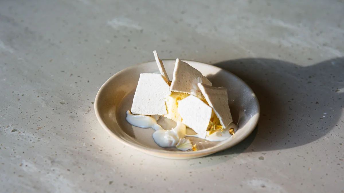
- Side light is your default. Light coming from the left or right reveals texture and shape. Use it for almost everything.
- Backlight (light behind the dish) can look dramatic and is great for drinks, steam, and translucent items — but you usually need a reflector in front to fill the shadows.
- Overhead or direct front light flattens food into a featureless blob. This is what most kitchen ceiling lights do, and it is usually the worst option.
A simple rule: if your photo looks flat and lifeless, move the light to the side and watch texture appear.
2) Softness: how harsh or gentle the shadows are
Softness is about the quality of shadows, not their direction. Hard light creates sharp, ugly shadow edges and harsh glare. Soft light wraps gently around the food and reads as premium.
- Soft window light is the best free source there is — naturally diffused and flattering.
- Direct sun is harsh. Soften it by hanging a sheer curtain, a piece of white fabric, or a diffuser between the sun and the dish.
- A bare LED or phone flash is hard and unflattering. If you use an LED panel, add a diffuser or bounce it off a white surface.
A white foam board or sheet of paper opposite your light acts as a reflector, bouncing light back into the shadows so they stay gentle. This single cheap tool dramatically improves most setups.
3) Color: keep the food looking like real food
Color is where mixed lighting wrecks photos. When window light, warm overhead bulbs, and green-tinted fluorescents all hit the same dish, your phone cannot balance them and the food turns yellow, green, or grey.
- Use one consistent light source. Turn off the overhead kitchen lights when you shoot near a window.
- Avoid mixing color temperatures. Daylight is cool, tungsten bulbs are warm, fluorescents are green — pick one and commit.
- Check your whites. If a white plate looks yellow or blue on screen, your color is off; fix the light source before you reach for an editor.
Accurate color is not just aesthetic. It builds trust, because a customer who orders based on the photo expects the real dish to match. The link between accurate, appetizing photos and orders is covered in why food photos make people order.
Putting it together: the one setup that works
You can build a reliable lighting setup in minutes:
- Place a table 2–3 feet from a window.
- Position the dish so window light comes from the side.
- Hold a white foam board opposite the window to soften and fill shadows.
- Turn off overhead lights so the color stays clean.
- Diffuse direct sun with a sheer curtain if the shadows look harsh.
That is it. The same setup works for burgers, bowls, drinks, and desserts — only the angle changes. Keeping the setup consistent is what makes your whole menu look like one brand, which is the foundation of the restaurant menu photo SOP.
When lighting goes wrong: quick fixes
| Symptom | Likely cause | Fix |
|---|---|---|
| Flat, lifeless food | Front or overhead light | Move light to the side |
| Harsh, hard shadows | Direct sun or bare bulb | Add a diffuser between light and dish |
| Yellow or green cast | Mixed light sources | Turn off overheads; use one source |
| Dark photo | Not enough light | Move closer to the window; add a reflector |
| Glare stripe on sauce | Hard reflection | Rotate the plate or raise the light angle |
For glossy items specifically, glare is a reflection you move rather than an editing problem — our BBQ and grill phone guide walks through controlling shine on sauces and glaze.
Lighting by dish type
The three fundamentals stay the same, but the emphasis shifts by category:
- Burgers and stacked dishes: side light at a 45° angle reveals the layers; diffuse it so melted cheese and sauce do not blow out into glare.
- Bowls and salads: softer, slightly more frontal light keeps every ingredient readable from above without harsh shadows hiding the back of the bowl.
- Drinks and anything translucent: backlight makes liquids and ice glow; add a reflector in front to fill the shadows on the glass.
- Glossy or saucy plates: raise the light higher and to the side to push reflections off the food; this is reflection control, not editing.
- Dark foods (BBQ, chocolate, coffee): keep the light to the side and place the food on a lighter surface so the camera has something to expose against and detail does not crush to black.
A note on artificial light
You do not always have a good window. A single soft LED panel can fully replace daylight if you treat it the same way: put it to the side, diffuse it, and keep it as the only light by turning off the overheads. The advantage of artificial light is consistency — it looks identical at 9am and 9pm, which is exactly what you want for a menu that should feel unified. The mistake to avoid is mixing the LED with ambient room light of a different color, which reintroduces the color-cast problem the fundamentals are meant to solve.
Where enhancement helps (and where it cannot)
Good lighting at capture time is always the foundation, but honest enhancement can finish the job — correcting residual color casts, lifting shadows, and cleaning the background on your real dish without changing the food. What it cannot do is rescue a photo that was lit badly from the start: blur, blown highlights, and chaotic shadows are best fixed by reshooting with better light. Nail the three fundamentals first, then enhance. You can test the difference on a single photo with the FoodPhoto.ai.
Control direction, softness, and color, and your phone will produce clean, accurate, professional-looking menu photos every time. When you are ready to polish and standardize a whole batch, start with a Menu Test Pack and check pricing.
Frequently asked questions
What are the fundamentals of food photography lighting?
Three things: direction (where the light comes from), softness (how harsh or gentle the shadows are), and color (avoiding mixed light that turns food yellow or green). Control those three and most lighting problems disappear. Side light for depth, a soft single source for gentle shadows, and one consistent light color for accurate food tones.
Is window light good for food photography?
Yes — soft, indirect window light from the side is the single best free light source for menu photos. It is naturally diffused, shows texture without harsh shadows, and renders food color accurately. Direct sun is too harsh; soften it with a sheer curtain or diffuser, and avoid mixing it with overhead kitchen lights.
Why does my food look yellow or green in photos?
Mixed lighting. When window light, warm overhead bulbs, and green-tinted fluorescents all hit the dish, your phone cannot balance the color and the food looks off. Turn off the overheads, shoot with one consistent light source, and the color corrects itself before you even edit.
Should the light be in front of, behind, or beside the food?
Beside, for most dishes. Side light creates the small shadows that reveal texture like crisp edges, sauce sheen, and layers. Backlight can look dramatic for drinks and steam but needs a reflector to fill the front. Front or overhead light flattens food and is usually the worst choice.
Create consistent menu photos with FoodPhoto.ai