The Restaurant Photography Brand Style Guide: A Working Framework
A taqueria owner once sent me her delivery menu and asked why it "felt cheap." Half the dishes were shot top-down on white plates. Half were at 45 degrees on dark wood. Two were on marble a relative had shot on a phone. Salsas looked plastic-red. The agua fresca was in a stemmed wine glass — wrong brand, wrong era, wrong dish. None of the photos were bad alone. Together they had no voice. She did not have a brand problem. She had a style guide problem — and a restaurant photography brand style guide is exactly what fixes it.
Why this matters now
A restaurant in 2026 lives across at least eight visual surfaces: website, Google Business, Uber Eats, DoorDash, Grubhub, Instagram, TikTok, and whatever printed touchpoint still exists. Each crops differently and rewards consistency. A diner scrolling a delivery app compares your row of nine thumbnails to the rows above and below. If your row reads as nine different restaurants, you have already lost.
A photography style guide is the cheapest brand asset you will make and the most ignored. Most operators have a logo guide and a tone-of-voice doc; almost none have a visual standard for what a dish photo looks like. What follows is a forkable framework — the parts that change per brand and the parts that do not — drawn from auditing brand photography systems for dozens of independent restaurants and small groups.
What goes wrong without a guide
Three failures repeat across nearly every audit:
- Angle drift. An owner shoots the flagship hero at 45 degrees. Six months later an intern shoots specials top-down for Reels. A year later a delivery-app vendor defaults to overhead. Three angles, three brands.
- Palette confusion. A brand picks a "moody" look, then photographs half the dishes on a sun-bleached café table because that is where the light is. The menu now has two visual temperatures.
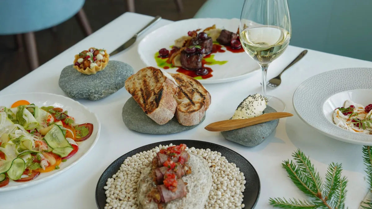
- Prop incoherence. Cutlery, glassware, and linens get treated as background. They are actually the loudest brand signal in food photography. A modernist tasting room shooting on the same earthenware as a casual taqueria reads false, even if the dishes are extraordinary.
Style guides solve all three by making defaults explicit before any camera comes out. This is the look-and-feel layer that sits on top of the operational multi-location photo governance system many groups run.
The five pillars of a restaurant photography style guide
Every guide worth keeping has the same five sections. The contents change radically by brand; the structure does not.
1. A color palette anchored to plate, table, and light
A palette is not a swatch board pulled from your logo deck. It is a working set of three to five colors that live together inside the frame: plate, table, light temperature, and one or two accents that recur in props or garnish. Pick them so they hold across at least 80% of your menu, not just hero dishes.
A taqueria might land on terracotta (plate), warm masa cream (linen), charred-corn black (accent), and one saturated turmeric yellow reserved for the elote — four colors chosen because they survived warm light and read correct on chiles, cheese, and grilled meat without going radioactive. A café might choose bleached oak, cream-glazed off-white ceramic, cool morning light with a mild warming gel, and a desaturated forest green pulled from the apron. Palettes are operational decisions. Pick what your kitchen, your dishes, and your room can actually deliver.
2. A lighting recipe per cuisine type
Lighting is where most style guides go vague. "Natural, bright, appetizing" means nothing to the person holding the camera at 6:30am. A working guide states the recipe — and the distances below are starting points, not mandates:
- Mexican (taqueria): single key from camera-left at 45 degrees, small softbox, warm white balance, minimal fill — let chile shadow and tortilla char do the work. Overhead only for flat dishes.
- Italian (pasta-forward): 90-degree side light, larger softbox, neutral-cool white, fill card at ~80%. Skim a highlight across pasta ridges; steam from the back.
- Japanese (sushi, izakaya): top-light bias for nigiri so the rice grain reads; 45 degrees for ramen. A touch of backlight gives sashimi translucency.
- French bistro: broad, soft, slightly warm light from the rear-left — a Paris-window look. Sauce gloss and butter sheen are the heroes.
- Café (brunch): diffused window light from the side, no flash, cool-neutral white, a close reflector. Latte art reads at a slight downward angle, not overhead.
- Indian / Levantine (gravies, mezze): warmer key with deep fill so dals and sauces do not go flat; soft top-down with broad overhead diffusion for a full mezze table.
These are not universally correct. The point is that your guide names the recipe so the freelancer you hire next quarter shoots the same way your in-house phone photographer is shooting today. For the fundamentals behind any of these, see our restaurant lighting guide.
3. Composition rules per channel
Different channels reward different crops. A working guide tells you which:
- Square (1:1) for Instagram grid, Google Business, and most delivery thumbnails. Subject ~60% of the frame, centered.
- Landscape (16:9 or 3:2) for website hero and in-store screens. Environmental context at the edge; dish in the right-third focus.
- Portrait (4:5 or 9:16) for feed and vertical short-form. Tall stacks (burgers, layered desserts, pours) belong here; flat dishes fight the frame.
The rule worth enforcing: every menu has one default angle (usually 45 degrees) and one allowed exception (usually top-down for flat dishes — pizza, mezze, sushi platters, large salads). Anything else needs sign-off from whoever owns the brand.
4. Prop language: linens, cutlery, glassware
Props are the brand. Most operators get this wrong because they treat props as background. The discipline: pick three plates, two surfaces, one cutlery line, one glassware family, and two linen options. Photograph everything on these. Anything outside the kit requires explicit reason.
Era matters more than people realize. A casual margarita in a hand-blown coupe reads false; a craft cocktail in a heavy 1980s tumbler reads cheap. Glass and drink should belong to the same world. Match prop era to dish era, and keep your surfaces consistent — our budget backdrops guide covers cheap surfaces that hold up across a full menu.
5. Styling do's and don'ts
Every brand has a list. A good one starts the same.
Do: pull from the line at peak (if the chef would not serve it, do not photograph it); plate the actual menu item; wipe the plate rim twice; light red as red instead of pushing tomatoes to fire-engine; shoot during prep, not service.
Don't: add herbs that do not appear on the served dish; use motor oil for grill marks or shaving cream for ice cream; fake steam on a dish that has been cold for two hours; mix angles within a delivery-app row. Customer trust dies once — honest enhancement of the real dish always beats a fake that the order will contradict.
The brand consistency tests
You have a guide and a shot menu. How do you know it is working? Three fast tests:
- The 9-tile thumbnail grid. Lay out nine dish thumbnails in a 3×3 at delivery-app size. Squint until they blur. Tiles that jump out — wrong color temperature, angle, or plate — get pulled and reshot.
- The hand-over-eyes squint. Open your live delivery app, cup your hand so only your row is visible, and ask whether your nine thumbnails look distinct from the rows above and below. If they read like every other restaurant, your brand has no signal.
- The row-recognition test. Show the row to three regulars with no preamble. Can they identify the dishes from thumbnails alone? If yes, the photography is doing its job.
Run these at every quarterly refresh. They take about twelve minutes and routinely catch real failures — a taco line shot at the wrong angle by a vendor, a brunch dish that went radioactive under fluorescent light, a fine-dining quarterly that drifted "moody" when the brand was "spare." A full menu photo audit is the deeper version of this when you want a complete pass.
SOP for new dish photo briefs
The moment a new dish hits the menu, the kitchen needs to know how to brief a photo. The one-page brief that fits on an index card is the operational core of the whole guide. Per dish, document:
- Dish name and category (entree, app, special, beverage)
- Primary plate from the kit
- Surface from the kit
- Angle (default 45 degrees unless flat-dish exception)
- Lighting recipe ID from your cuisine library
- Prop additions (none unless explicit — name them and explain)
- Channel deliverables (square, landscape, portrait — all that apply)
- Crop notes for the platform mix
- Sign-off owner (one named person, not a department)
A brief should never reach a freelancer or in-house team with a blank field. Blank field, do not shoot yet.
A printable shooting checklist
Laminate this and hand it to anyone about to take a photo for the brand:
- [ ] Plate and surface are from the documented kit
- [ ] Angle matches the category default (or the exception list)
- [ ] Lighting recipe matches the cuisine
- [ ] White balance locked manually
- [ ] Plate rim wiped twice
- [ ] Garnish is what the customer receives, not extra
- [ ] No props added outside the kit
- [ ] Saturation pulled back where reds dominate
- [ ] Shadow direction matches the rest of the menu
- [ ] Square, landscape, and portrait crops captured where applicable
- [ ] Filed under the correct brand and dish name
- [ ] Sign-off owner approved before publication
Honest caveats
A style guide is a constraint, and constraints are unpopular. You lose some flexibility; you gain enormous brand consistency. Most operators are over-flexible and under-consistent, so a guide moves them the right way. Guides also age — revisit yours every 18 months, especially after a supplier change. And a guide amplifies a coherent identity; it cannot invent one. If dishes are not visually distinct, no palette discipline will rescue them.
Where enhancement fits the framework
A style guide defines the target; honest AI enhancement helps every dish hit it consistently. Capture each item against your documented kit and lighting recipe, then enhance to lock white balance, even out the surface, and clean stray distractions — without changing the food. That is how a busy kitchen keeps a whole menu on-palette and on-angle without booking a studio for every special.
You can test enhancement on your own dishes with a one-time $10 Menu Test Pack (10 credits), with plans from $15/month (50 credits) and credits that roll over — see the pricing page. Or run a real dish through the Menu Test Pack to see how cleanly it lands against your style guide before you commit.
Frequently asked questions
What is a restaurant photography brand style guide?
It is a short document that defines how every dish photo should look so a menu reads as one brand across delivery apps, website, and social. A working guide covers five pillars: a color palette anchored to plate, table, and light; a lighting recipe per cuisine; composition rules per channel; a prop language for linens, cutlery, and glassware; and styling do's and don'ts. The contents change per brand; the structure does not.
Why do restaurant menu photos look inconsistent?
Three causes account for most of it: angle drift (different people shoot the same brand at different angles over time), palette confusion (dishes shot under different light or on different surfaces), and prop incoherence (cutlery, glassware, and linens treated as set dressing instead of brand signals). A style guide fixes all three by making the defaults explicit before any camera comes out.
How do I keep menu photos consistent across delivery apps?
Pick one default angle for the menu (often 45 degrees) and one allowed exception (top-down for flat dishes), lock white balance manually, photograph everything on the same documented plates and surfaces, and run a 9-tile thumbnail test before publishing. If a row of thumbnails reads like nine different restaurants, pull and reshoot the outliers.
How often should a restaurant update its photography style guide?
Revisit it roughly every 18 months, or sooner if a supplier change alters your plates or glassware. Palettes drift, plate lines get discontinued, and brand direction evolves. Between updates, run a quick quarterly consistency test on your live menu to catch slow drift before it compounds.