Restaurant Menu Photo Audit: 27 Fixes to Make Your Photos Look More Expensive Today
Most restaurant photos do not fail because the food is bad. They fail because the photo is confusing, inconsistent, or untrustworthy at thumbnail size. A restaurant menu photo audit is how you find and fix that quickly — and this guide gives you the exact 27-point scorecard plus the fix for each issue.
Run it once and you get two things: a clear list of what is hurting your current menu photos, and a ranked action plan for what to reshoot versus what to enhance and re-export today. It is written for owners, operators, and marketers who need menu-ready photos for delivery apps, website menus, Google Business Profile, and social — not for editorial or cookbook-style shoots where mood beats clarity.
The only goal of a menu photo
At thumbnail size, a customer should instantly answer three questions: What is it? Is it worth the price? Does this restaurant look legit? If your photos fail that test, people scroll past. Everything in this audit serves those three answers.
How to run the audit in 20 minutes
Pick ten items so the sample reflects your business:
- 3 top sellers
- 3 high-margin items you want to push
- 2 new or special items
- 2 items that currently look weak on apps
For each item, score the checklist below as pass, fixable without reshoot, or needs reshoot. Then do the fixes in this order: thumbnail clarity and cropping first, lighting and color accuracy second, background cleanup and consistency third. That order front-loads the changes customers notice most.
The 27-point menu photo checklist
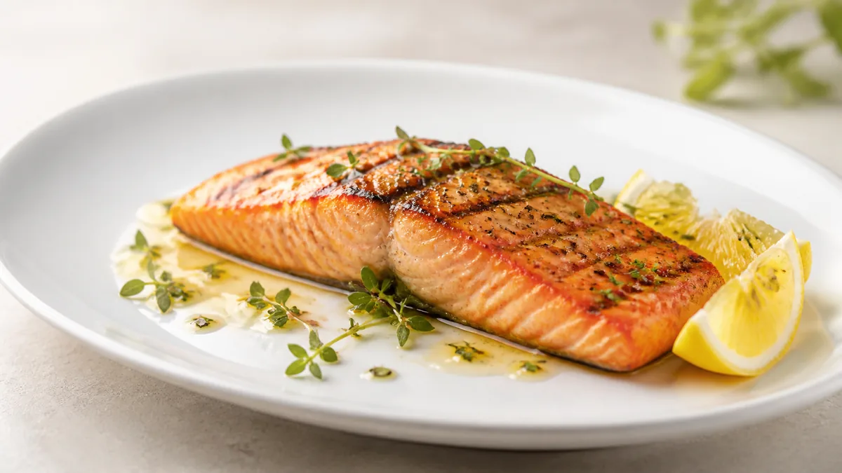
A) Thumbnail clarity — your highest ROI
- The dish is obvious in one second (no mystery plates).
- The hero ingredient is visible (the protein or main item is not hidden).
- The photo reads at small size (no tiny dish floating in a huge frame).
- The background does not compete with the food.
- The crop is safe for delivery thumbnails (no chopped-off hero).
Fast fixes: re-crop with the hero centered and bigger, remove distractions (extra plates, hands, receipts, napkins), and standardize one angle for a menu section.
B) Lighting — the difference between "phone pic" and "menu photo"
- No harsh overhead shadows.
- No blown highlights (white glare on sauce or cheese).
- No mixed lighting (yellow or green cast from kitchen lights).
- Shadows look intentional — soft, not muddy.
- The food has texture — crisp edges visible, not flat.
Fast fixes: turn off overhead lights and use window light or one consistent source, add a white bounce card opposite the light, and diffuse harsh shine with a sheer curtain. If the base photo is decent, AI relighting can correct uneven lighting and improve clarity without changing the dish. Our restaurant lighting guide covers the one setup that works in any kitchen.
C) Color accuracy — trust
- Whites are actually white (plates, rice, cream sauces).
- Greens look fresh, not gray or neon.
- Reds look edible, not nuclear.
- The color matches what customers actually receive.
Fast fixes: shoot in the same lighting every time, avoid auto filters that crank saturation, and lock white balance so it stays consistent across the whole menu.
D) Composition and scale — make it feel worth buying
- The dish fills the frame but keeps breathing room.
- Plate edges are clean (no smears or crumbs).
- The angle matches the dish (45° for stacks, top-down for bowls and pizzas).
- The portion looks honest, not weirdly tiny from a distance.
- No wide-angle distortion (avoid the 0.5× lens).
Fast fixes: move closer and use the 1× lens, use a tripod to keep distance consistent, and stick to two or three standard angles for the whole menu.
E) Background and props — premium without clutter
- The background is consistent across categories.
- Props are minimal and intentional — one accent, not five.
- No messy tables (wrappers, sanitizer bottles, receipts).
- No competing patterns (busy tablecloths, loud logos).
Fast fixes: pick one default surface (wood board or stone mat), remove everything that is not the dish, and if your restaurant vibe is the brand, add one signature element — not one in every photo. A consistent surface is cheap; our budget backdrops guide lists six that look professional.
F) Consistency across the menu — the "chain" effect
- Similar dishes share framing (all burgers at the same zoom and angle).
- Lighting is consistent across the menu (no random warm/cool swings).
- Editing style is consistent (same contrast, same background tone).
Fast fixes: write a one-page style guide (angle, background, crop, brightness target), batch-process so edits match, and use the same enhancement settings across the set.
G) Platform exports — avoid rework
- You have the right sizes for delivery apps, website, and social.
Fast fix: export each dish into multiple crops (square, 4:5, 16:9, and any platform-specific size) and store them in a predictable folder so staff can find them. To keep uploads clean, pair this with a delivery app photo QA checklist before you publish.
What to fix first: a ruthless priority list
If you only have one hour today:
- Pick your ten menu items (top sellers plus high margin).
- Re-crop so the dish fills the frame and is centered.
- Fix lighting and color consistency (kill yellow and green casts).
- Clean backgrounds and remove clutter.
- Export platform crops and replace the photos on your delivery apps.
Everything else is secondary.
When you actually need a reshoot
Do not waste time trying to "save" a genuinely bad photo. Reshoot when the image is blurry, the food looks dry or old, the portion is wrong, hands or people block the product, or the angle makes the dish unrecognizable. Enhance instead when the photo is mostly sharp but dark, the background is messy, the color is off, or you simply need consistent crops and sizes. Most of your menu falls in the second group, which is faster and cheaper to fix.
Turn the audit into a habit
Run this audit once to clear the backlog, then switch to a short weekly system so you never fall behind again. Re-enhance individual items whenever a recipe, plating, or special changes rather than letting the whole menu drift.
The cleanup and re-export work pairs well with in-house AI enhancement: keep one high-resolution master per dish, fix lighting and background, and export platform crops without booking anyone. You can test it on your own photos with a one-time $10 Menu Test Pack (10 credits), with plans from $15/month (50 credits) and credits that roll over — see the pricing page. Or drop a current menu photo into the Menu Test Pack and watch the audit fixes happen in seconds.
Frequently Asked Questions
What is a restaurant menu photo audit?
It is a quick, structured review of your existing menu photos against a fixed checklist — thumbnail clarity, lighting, color accuracy, composition, background, consistency, and platform crops. You score each item as pass, fixable without a reshoot, or needs a reshoot, then fix in priority order. It takes about 20 minutes for ten dishes.
How do I make my food photos look more expensive?
Most of the gain comes from three things: crop so the dish fills the frame and the hero ingredient is centered, fix lighting and color so whites are neutral and reds look edible, and clean the background so nothing competes with the food. Consistency across the whole menu does the rest — similar dishes framed and lit the same way read as one premium brand.
Should I reshoot or enhance a weak menu photo?
Reshoot if the photo is blurry, the food looks dry or old, the portion is wrong, or hands or people block the dish. Enhance instead if the photo is mostly sharp but dark, the background is messy, the color is off, or you just need consistent crops and sizes. Enhancement is faster and cheaper for the second group.
Which menu photos should I fix first?
Start with the items that drive money: your top sellers, the high-margin dishes you want to push, and any item that currently looks weak on delivery apps. Fixing the photos customers actually see most returns the fastest, so do those before touching low-traffic items.