Restaurant Ads Creative Playbook (2026): Make Your Photos Do the Selling
In 2026, restaurant ads are not won by clever targeting. They’re won by clarity. Your audience scrolls fast, compares options, and decides based on the photo before they read a single word. That is why restaurant ads creative, not budget or audience settings, is the highest-leverage thing you can fix. This playbook shows how to build photo-led ads that convert, without fake claims or gimmicks, and how to wire them to landing pages and a testing loop that actually compounds.
The core idea: ads don’t create clarity, they amplify what you already have. If your menu photos are clean, consistent, and believable, ads get cheaper. If they’re a mess, ads just accelerate the loss.
Why most restaurant ads fail
When an ad underperforms, the easy explanation is "Meta is broken" or "Google is too expensive." The real reason is almost always the creative: the food isn’t obvious, isn’t believable, or isn’t tied to a clear action. Three shifts make this worse in 2026:
- Creative fatigue is faster. People see more ads, so yours need clarity and variety to keep working.
- Trust is stricter. Over-edited food and exaggerated claims get called out and quietly punished by both audiences and platforms.
- People compare across surfaces. Your ad image needs to match what they see on delivery apps and Google, or the mismatch kills the click.
The strategy is not "run more ads." It’s "build a better photo system and a better creative system."
The conversion chain ads actually depend on
For a restaurant or a restaurant-photo product, the chain looks like this:
Ad → landing page → offer → checkout → usage → repeat.
Most operators optimize only the first step. But the chain breaks in several places at once: a generic landing page, an unclear offer, inconsistent photos, no proof. Fix the whole chain and the ad cost drops on its own, because every click is more likely to convert and stick.
Four creative principles that win
These hold across every platform.
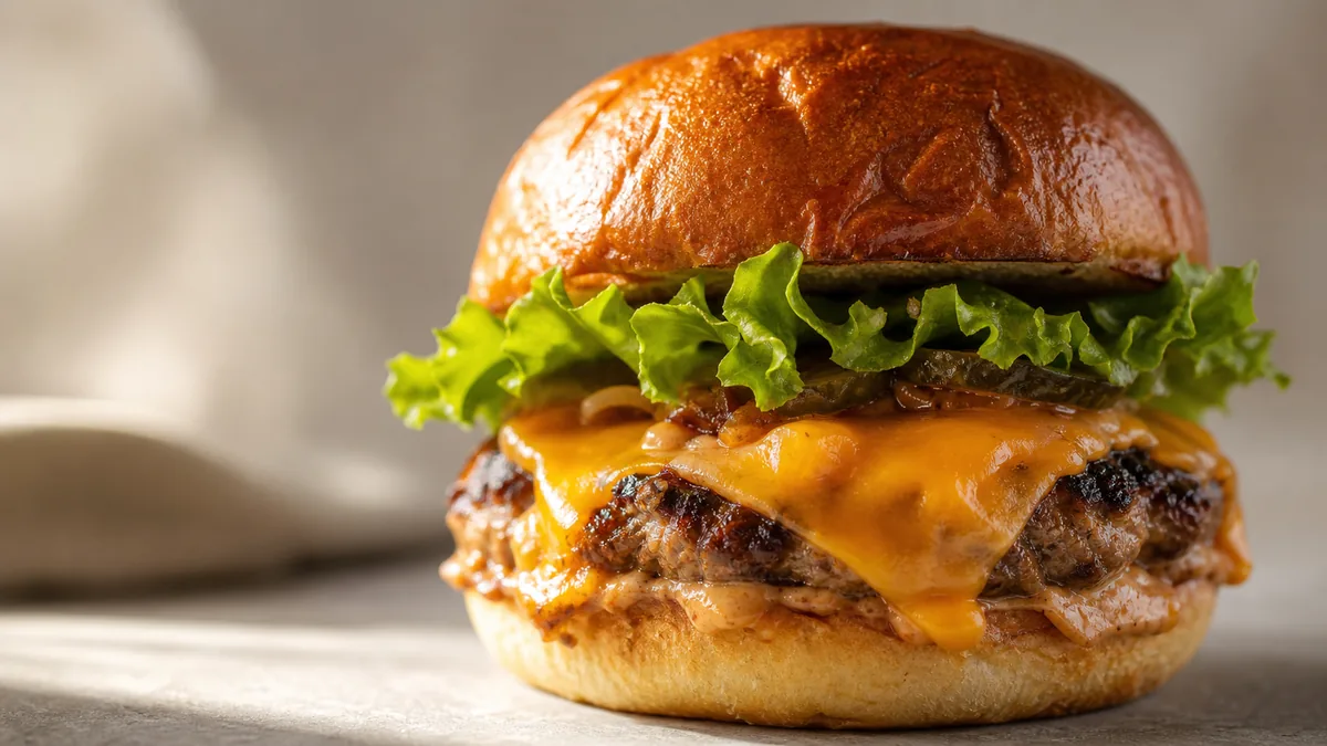
- Make the dish obvious at thumbnail size. Zoom out until the image is tiny. Can you still tell what it is? If not, crop tighter and remove clutter.
- Make it believable. Over-edited food creates skepticism. Improve lighting and consistency; never change the dish itself.
- Show one thing at a time. One hero dish almost always beats a collage. A frame trying to show the whole menu shows nothing.
- Use proof frames. For delivery and first-time buyers, show packaging, portion, and what actually arrives. Proof reduces hesitation more than adjectives do.
The single most important takeaway: if a photo doesn’t pass the thumbnail test, no targeting or budget will save the ad.
The six ad formats every restaurant should own
Build a small, repeatable library instead of chasing one viral idea.
| Format | Best for | Key rule |
|---|---|---|
| Single hero dish (still) | Clarity and conversion | Tight crop, clean background, dish name in text not in the photo |
| Before/after | Showing transformation | Same dish and framing, honest labels |
| Best-seller carousel | Choice without confusion | One dish per card, consistent framing |
| Proof carousel | Delivery trust | Hero shot + in-container + packaging |
| Short vertical clip (6-10s) | Attention and reach | One simple action: drizzle, slice, pour, pull-apart |
| Offer creative | Promotions | One offer, one time window, one next step |
If you only have time to build two, build the single hero still and the proof carousel. They carry most of the weight.
Platform playbook: Google Search (high intent)
Search is where you capture existing demand. The creative is mostly text, but the landing page and the images on it still decide whether the click converts.
Send each keyword cluster to a matching page:
- General intent ("menu photo editor") → a clear, photo-led offer page
- Platform intent ("DoorDash photo requirements") → a page that speaks to that platform
- Money intent ("restaurant photography cost") → pricing and cost comparisons
Keep ad copy aggressive but defensible. Strong framing like "a shoot can easily run $500+ depending on scope and market" works. Absolute claims like "photographers always cost at least $500" or "guaranteed results" invite disputes and policy trouble. The rule: aggressive is fine, unprovable is not.
Platform playbook: Meta (Facebook and Instagram)
Meta rewards visual clarity, which is your advantage. Cold prospecting creative that tends to work:
- A short before/after clip (8-12 seconds)
- A static before/after with large, simple labels
- A single hero dish with minimal text
- A proof carousel: hero + packaging + a crop-safe export
Retargeting should remove the last doubts in order. Show examples (does it work?), then pricing clarity (what does it cost?), then risk reversal (cancel anytime, start small). A simple seven-day retargeting sequence runs proof on days 1-2, offer clarity on days 3-4, and risk reversal on days 5-7.
Landing pages: the step most restaurants skip
Never send paid clicks to a generic homepage. Build one page per intent, structured to answer the four questions a buyer is silently asking:
- Headline — one clear promise
- Proof — real before/after examples
- How it works — three steps
- Social proof — real, never fabricated
- Pricing and deliverables — what you get, stated plainly
- Risk reversal — guarantee or "cancel anytime"
- CTA — one obvious action
If a visitor can’t immediately answer "what is this, what do I get, how much, how fast," conversion drops. Our menu photo audit checklist is a good source for the before/after proof frames these pages need.
A four-week testing plan that’s simple and brutal
Don’t test ten things at once; you’ll learn nothing. Change one variable per week.
- Week 1 — Creative. Same targeting, same budget split, four creatives: single hero, before/after, proof carousel, short clip. Pick the winner on click quality and signups.
- Week 2 — Landing page. Keep the best creative. Test a short, direct page against a longer, proof-heavy one.
- Week 3 — Offer framing. Test "plans from $15/mo (50 credits)" against "start with a $10 Menu Test Pack (10 credits)."
- Week 4 — Retargeting. Build sets for visitors, pricing visitors, and checkout starters, and show examples, pricing clarity, and a guarantee.
This loop is what turns ads from gambling into a system.
What to measure before you scale
If your entry offer is small, you win on retention and upgrades, not on a single purchase. Track signup starts, billing views, first photo completed, top-up purchases, and the month-2 renewal rate. These tell you exactly where the chain breaks:
- Clicks but no signups → fix landing page and offer clarity.
- Signups but no first photo → fix onboarding.
- First photo but no renewal → fix ongoing value and usage prompts.
Don’t scale ad spend on weak retention. That’s how budgets burn.
The creative rule that improves everything else
If you fix only one thing, fix the clarity and consistency of your menu photos. Better photos lift ad attention, landing-page conversion, delivery-app click-through, and the freshness signals search engines reward. That single asset compounds across every channel, which is why a repeatable photo workflow is a growth system, not a one-off cost.
The cheapest way to keep that library fresh is to enhance real phone photos of the dishes you actually serve instead of booking shoots. FoodPhoto.ai fixes lighting, backgrounds, gloss, and crops without changing the food, so you can produce a clean hero and its proof frames in minutes. You can try it on your own dish in a Menu Test Pack before deciding, and for delivery-listing creative specifically, the Uber Eats photo upgrade guide pairs well with this playbook.
Build a small library of believable creatives, send each click to an intent-matched page, and measure retention before scaling. Do that and ads stop feeling like a slot machine. When you’re ready to produce ad-ready photos cheaply, start with a $10 Menu Test Pack on the pricing page.
Frequently Asked Questions
What makes restaurant ads creative actually convert in 2026?
Clarity beats cleverness. The dish has to be obvious at thumbnail size, the photo has to look believable (not over-edited), and the ad has to point to one clear next step. Targeting and budget matter far less than a clean, consistent hero image and an intent-matched landing page.
Do I still need video, or are still photos enough for restaurant ads?
Still photos are not dead. A tight, well-lit single-dish still often beats a busy collage or a low-effort clip. Add a short 6-10 second action clip (a drizzle, a slice, a pour) only after your still creative is working, so you have variety without extra production load.
How many ad creatives does a restaurant need?
You don’t need new concepts every week. Build a small library of six repeatable formats (single hero, before/after, best-seller carousel, proof carousel, short action clip, offer creative) and rotate them across dishes, formats, and contexts to avoid creative fatigue.
What should I measure before scaling restaurant ad spend?
Track the full chain: landing page view, signup start, billing view, first purchase, and month-2 renewal. If people click but don’t convert, fix the landing page and offer. If they convert but don’t return, fix value and onboarding before you spend more.