Delivery App Thumbnails: Make Menu Photos Win the Scroll (DoorDash + Uber Eats)
Delivery apps are not menus — they are marketplaces. That single fact changes what "good food photography" means: you are not trying to impress a photographer, you are trying to win a one-second decision on a phone screen. This is a practical, restaurant-owner playbook for delivery app thumbnails on DoorDash and Uber Eats — crop-safe framing, the dish-by-dish rules, and a workflow to upgrade your whole menu without a photoshoot. Get the thumbnail right and you win the scroll; get it wrong and the best food in town never gets the click.
The only test that matters: the thumbnail test
Before you upload any photo, do this:
- Open the photo on your phone.
- Zoom out until it is roughly the size of a delivery-app thumbnail.
- Ask: "Can I tell what this is in one second?"
If the answer is "kind of," choose a different frame or reshoot. The thumbnail test fixes most menu-photo problems because it forces clarity — and clarity is what converts at thumbnail scale. A gorgeous photo that only works full-screen is losing you orders every day.
The 5 thumbnail rules that win clicks
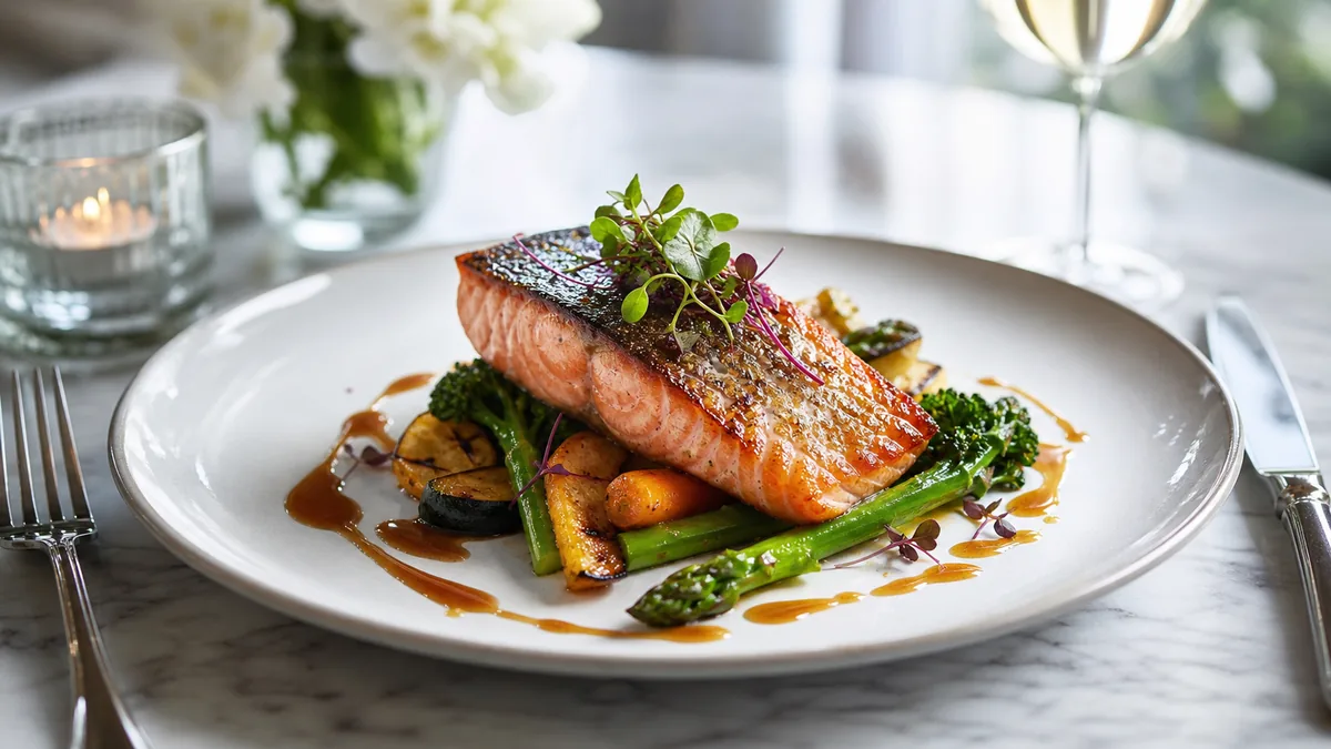
1. One hero ingredient
Every winning thumbnail has a main character. If the dish has multiple components — combos, platters, bowls — arrange them so the eye instantly knows what to look at.
Avoid: scattered ingredients, busy garnish that hides the food, and multiple plates competing in one frame. Keep: one clear focal point the customer can name at a glance.
2. Big, simple framing with breathing room
Fill the frame so the food is large — but leave a margin so platform crops do not cut into it. Delivery apps apply their own square and rectangular crops, and shooting too tight is the most common mistake:
- The burger loses the bun.
- The bowl loses its rim.
- The pizza loses the slice edges.
Fill the frame, but leave safe space. This is the single rule that survives every crop DoorDash and Uber Eats throw at it. For the exact platform sizes and export specs, pair this with our delivery app thumbnail rules and crop-safe framing thinking and shoot once, export many.
3. Accurate color — yellow food is a sales killer
Kitchen lighting makes food look yellow, green, or flat, and a yellow-tinted dish reads as old or greasy at thumbnail size. Fix it at the source:
- Shoot near a window with the overhead lights off.
- Avoid mixing warm and cool light sources in one frame.
- Use a white foam board opposite the window to soften shadows.
Honest color is non-negotiable on delivery apps because the customer compares the photo to what arrives. Boosted, neon food triggers "photo didn’t match" reviews; accurate color builds repeat orders.
4. Clean background — clutter kills thumbnails
At thumbnail size, every extra object becomes noise. Remove towels, receipts, hands, extra plates, and messy prep containers. Keep one plate or bowl and at most one consistent accent — a napkin, tray, or parchment — if you use it across the menu. A clean background instantly makes the same dish look more expensive.
5. Consistency across the menu
One great photo in a menu of random shots actually makes the rest look worse. The brands that win delivery use the same background, angle logic, and brightness across every item. That coherence signals "real brand" and lifts the perceived quality of the entire menu — even the items you have not reshot yet.
Dish-type shot guide
Different foods photograph best at different angles. Pick one default per type and keep it consistent.
| Dish type | Best angle | Watch out for |
|---|---|---|
| Burgers / sandwiches | 30–45° | Cropping off the bun; keep the stack visible |
| Pizza | Top-down or low 30° | Slice edges getting cut by the crop |
| Bowls / poke / salads | Top-down | Rim getting cut; keep portion honest |
| Pasta / curry | 30° | Muddy color; lift highlights on the sauce |
| Fried foods | 30–45° | Greasy yellow cast; correct white balance |
| Desserts / drinks | 30° or eye-level | Glare on glaze and glass; rotate to soften |
If you want the deeper, dish-by-dish reasoning for the trickiest categories, our sushi and seafood phone guide walks through color and shine control that applies to any delicate dish.
Why the thumbnail beats the full photo
It is worth understanding why the thumbnail matters more than the full-size image, because it changes how you shoot. On DoorDash and Uber Eats, the customer almost never sees your photo at full size first. They see a grid or a scrolling list of small images, and they make a snap decision about which restaurant and which dish to tap based on those tiny pictures. The full-size photo only appears after you have already won the click — which means the thumbnail is doing the selling, not the hero shot.
This flips the usual photography priorities. Fine detail, subtle styling, and elegant negative space all read beautifully at full size and vanish at thumbnail scale. What survives the shrink is contrast, a clear subject, accurate color, and a clean background. So when you choose between two frames, do not pick the one that looks best on your laptop — pick the one that still reads in a one-inch square. That single habit, applied across your menu, is the difference between a listing that gets scrolled past and one that gets tapped.
The no-photoshoot upgrade workflow
You do not need to close the kitchen for a shoot. Run this loop:
- Shoot in batches. Photograph your dishes on a phone near one consistent light source.
- Apply the thumbnail test to every shot and keep only the frames that pass.
- Enhance, do not invent. Fix lighting, correct color, and clean the background — without changing the food.
- Export multiple crops so the same image works as a square thumbnail, a wide hero, and a vertical for social.
- Publish top sellers first, then work outward through the menu.
The enhancement step is where FoodPhoto.ai fits: upload a real phone photo of the real dish and it fixes lighting, color, gloss, and background while keeping the food honest. That honesty is what protects your reviews — the photo always matches the box. Try one of your best sellers in the Menu Test Pack and run the result through the thumbnail test.
A quick QA checklist before you upload
- One-second test passes at thumbnail size.
- Food survives the crop — nothing important touches the edge.
- Color is accurate, not yellow or boosted.
- Background is clean and consistent with the menu.
- Style matches your other top items.
Tick all five and the photo is ready to win the scroll.
Where to start
If you only do one thing this week, upgrade your three best-selling items and make their thumbnails consistent — that is where a better photo pays back fastest. When you are ready to bring the whole menu to one standard, the Menu Test Pack shows the before/after on a single dish, and the pricing starts with a one-time $10 Menu Test Pack so you can prove the lift before you scale it. For the broader cost picture across every option, see our food photography costs guide.
Frequently asked questions
What makes a good delivery app thumbnail?
A good delivery app thumbnail is instantly recognizable in one second at small size. It fills the frame with one hero dish, uses accurate color, has a clean background, and keeps breathing room so the platform’s crop doesn’t cut off the food. Consistency across the whole menu multiplies the effect.
Why do my DoorDash and Uber Eats photos get cropped badly?
Delivery apps apply their own square and rectangular crops, so a photo composed edge-to-edge loses the bun, rim, or slice edges. Shoot with safe space around the dish — fill the frame but leave a margin — so the food survives whatever crop the platform applies.
Do I need a professional photoshoot for delivery app photos?
No. Most delivery menus are won with clear, consistent phone photos enhanced for lighting and background. Shoot near a window, run the one-second thumbnail test, and use honest AI enhancement to fix color and clean the background — no studio required.
Which menu items should I upgrade first?
Upgrade your top sellers and highest-margin items first, then work outward. The dishes that already get the most views give you the fastest return on a better thumbnail, and a consistent style on your best items lifts the whole menu’s perceived quality.