Delivery App Photo Optimization (2026): Thumbnail-First, Multi-Crop, No-Rework Exports
Delivery apps are not menus — they are feeds, and feeds have one rule: if the photo is unclear, you lose the click. In 2026 that is more true than ever, because customers scroll faster, compare more options, and expect what arrives to match the picture. This guide gives restaurant operators a repeatable system for delivery app photo optimization — thumbnail-first composition, menu-wide consistency, and multi-crop exports — so you build photos that win the scroll instead of redoing work every week.
The mindset shift: your goal is not "pretty." It is orderable — obvious, appetizing, consistent, and trustworthy at the size customers actually see.
Your menu is a decision engine, not a gallery
Most restaurants still judge photos at full size on a laptop. Customers rarely see full size. They see tiny thumbnails, fast comparisons, and a list of competitors right next to you. Optimize for that reality first.
The thumbnail test
Before you upload anything, run this in three seconds:
- Zoom out until the dish is tiny.
- Can you tell what it is in one second?
- Does it still look edible and clear?
If the answer is no, fix the crop and clarity before you touch anything else. A winning delivery thumbnail has the dish filling most of the frame, the hero ingredient centered, a simple background, readable texture, and accurate color — not neon, not gray.
What kills thumbnails: a tiny plate far away, multiple dishes competing, dark food on dark tables, busy tablecloths, and stray hands or receipts in frame. The fast fix is almost always crop tighter and remove distractions.
Consistency across the menu is a conversion strategy
Customers compare items side by side. If your photos look inconsistent, they assume the food is inconsistent too. A unified menu signals quality control and reliability.
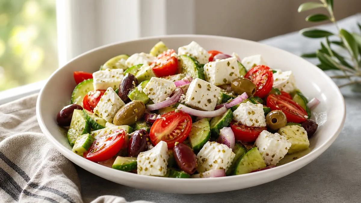
Pick a consistent approach per category and stick to it:
- Burgers and stacked sandwiches: 45° angle, tight crop, same background.
- Bowls and salads: top-down or 45°, same zoom level.
- Drinks: straight-on, consistent glass height and lighting.
- Desserts: close texture, clean plate edges, minimal props.
You do not need every dish to be identical. You need the menu to feel like one restaurant. For a deeper system, our restaurant menu photo SOP turns this into a repeatable shoot.
Multi-crop exports are expected (one frame everywhere breaks)
You will reuse the same dish across delivery apps, your website menu, Google Business Profile, and social. Each surface crops differently, so a single uploaded frame gets chopped somewhere — the hero gets cut, plate edges vanish, or the dish shrinks to nothing.
The no-rework rule: shoot one clean, slightly loose base photo per dish, then export the crops each surface needs. Leave breathing room around the dish at capture time so platform crops never cut the hero. For the exact sizes and aspect ratios, see our complete guide to delivery app AI photo requirements.
A simple export set per dish:
| File | Use | Framing |
|---|---|---|
| Enhanced master | Your clean, best version | Loose, full dish |
| Delivery crop | DoorDash / Uber Eats / Grubhub | Thumbnail-safe, hero centered |
| Website crop | Menu pages, headers | Medium |
| Social crop | Feed and stories | Square or vertical |
"Proof" frames now convert (trust, not aesthetics)
Delivery customers carry doubts: Will it travel well? Is the portion worth it? What does it look like in the container? Operators winning in 2026 add proof frames for key items — a packaging shot, an "in the container" shot, and a bundle layout for family meals. These are not about beauty. They reduce hesitation and refunds, which is why accuracy and trust are inseparable from conversion (more on that in why food photos make people order).
The weekly delivery photo workflow
Most restaurants fail because they treat photos like a big project. Treat them like prep instead.
- Build a station once. One background surface, one consistent light source (window or a single LED), a white bounce card, and a phone tripod. This is how you get consistent results at speed.
- Shoot clean base photos. Wipe the lens, use the 1x lens (no wide angle), fill the frame, keep plate edges and background clean. Enhancement can fix lighting and clutter — it cannot fix blur or chaos.
- Enhance for clarity and consistency, not drama: brighter even lighting, accurate color, clean background, one style across dishes.
- Export crops for each surface from the same master.
- Publish in priority order: top sellers first (highest impact), then high-margin items, then specials and bundles.
Dish-type playbooks for the hard categories
- Burgers and stacked sandwiches: 45° angle, tight crop, diffuse light to avoid glare on cheese and sauce, no wide-angle distortion.
- Pizza: top-down for whole pies, 45° for slices, pull one slice slightly to show layers, let it rest briefly so steam does not haze the lens.
- Bowls (ramen, poke, salads): top-down or tight 45°, clean rims, emphasize color contrast and texture.
- Fried food: blot excess oil, side light for texture, simple background — crispness, not grease.
- Drinks: straight-on, clean glass, diffuse light to soften highlights, no bar clutter.
QA before you upload, then a 10-second in-app check
Run this checklist on every photo: the dish is obvious and the hero is centered and not chopped; colors and portions look realistic; similar items share framing and lighting; and exports are thumbnail-safe. Then do the step most restaurants skip — open the app on your own phone and scroll your real menu. If a dish looks unclear, gets cut by the crop, or reads darker on mobile, re-crop and re-upload immediately. This single habit is the difference between "we updated photos but nothing changed" and a real lift.
Keep it honest
Your goal is appetizing and accurate. A photo that looks "too perfect" makes customers skeptical and a portion that over-promises produces refunds and one-star reviews. Use enhancement to improve lighting, cleanup, and consistency — never to change the dish. A good gut check: show the enhanced photo to someone on the line and ask, "Does this match what we serve today?" If they hesitate, dial it back.
If you only fix five photos this week
You are busy. Fix the photos that move revenue first: your top three best sellers, your top two high-margin items, then one bundle, one delivery-proof container shot, and one drink or dessert. Best sellers improve conversion immediately because they get the most exposure; high-margin items improve profit per order.
When your delivery thumbnails are clear, consistent, and accurate, customers stop hesitating and start ordering. You can polish a batch in minutes with the FoodPhoto.ai, and pricing is built for keeping a whole menu current week after week.
Enhance your real food photos in FoodPhoto.ai
FAQ
What is delivery app photo optimization?
It is the practice of shooting, cropping, and exporting menu photos so they stay clear and appetizing at thumbnail size and across every platform’s different crop. The core skills are thumbnail-first composition (the dish fills the frame and the hero ingredient is centered), menu-wide consistency, and exporting multiple safe crops from one clean base photo.
Should I show multiple dishes in one delivery photo?
Usually no. Single-item photos are clearer and win the scroll because the customer instantly knows what they are looking at. Reserve multi-item shots for bundles and family meals, and even then keep the layout clean, aligned, and uncluttered.
Do I need to reshoot photos or can I just enhance them?
Enhance when the base photo is sharp and well framed but needs better lighting, a cleaner background, or platform-safe crops. Reshoot when the photo is blurry, chaotic, badly framed, or does not match what you serve. Enhancement fixes lighting and clutter; it cannot rescue blur or a bad composition.
How do I check that my new delivery photos actually look good?
Open the delivery app on your own phone and scroll your menu in list view. Confirm each dish is still obvious as a thumbnail, the hero ingredient is not chopped by the crop, and the photo does not look darker on mobile than it did on your screen. Re-crop and re-upload anything unclear.
Look up the precise crop and file rules for each marketplace in the delivery app photo size & requirements hub.