Sushi & Seafood Menu Photos on a Phone (2026): Color, Shine, and Texture Without Making Fish Look Fake
Sushi is one of the most visual categories on any menu — people order it because it looks clean, fresh, and precise — and it is also one of the easiest dishes to ruin in a photo. Good sushi food photography on a phone in 2026 is about accuracy, not drama: neutral rice, controlled shine, and color that matches what arrives in the box. Get those three right and your seafood photos sell the order instead of triggering “photo didn’t match” reviews. This guide is the repeatable workflow — setup, angles, color rules, and editing — to shoot sushi, sashimi, poke, and seafood that converts on delivery apps without ever making the fish look plastic.
Why sushi is so hard to shoot
Sushi punishes small mistakes more than almost any other food. A burger can survive a slightly warm photo; raw fish cannot.
- Fish color is sensitive. A tiny shift toward green, yellow, or magenta makes tuna look old and salmon look dyed.
- Rice goes gray or yellow under the wrong light, and gray rice reads as “stale” instantly.
- Seaweed reflects light and can look oily or wet.
- Sauces and glaze turn into glare, which reads as plastic rather than fresh.
- Mixed lighting creates casts that are almost impossible to fix cleanly after the fact.
The fix for all five is the same idea: control the scene before you shoot, and enhance lighting rather than recoloring the food.
The 2026 trend: clean and accurate beats dramatic
Customers know what fish should look like. When sushi photos are over-saturated or pushed too far, people assume the image is fake — and on delivery apps that assumption costs you the order. The premium sushi look in 2026 is bright but not blown out, accurate in color, and consistent across the whole menu. That consistency is what makes a sushi brand feel high-end, and it is the thing most independent restaurants are missing.
The sushi photo station (simple, fast, repeatable)
You do not need a studio. You need control over light and background.
The setup
- One key light from the side — a window or a single soft LED panel.
- One white bounce card opposite the light to lift shadows and soften highlights.
- A matte, neutral background — light stone, clean white, or pale wood. Dark slate works well for premium platters.
- Clean plates and a microfiber cloth for wiping smudges and stray rice.
Why clean backgrounds matter for sushi
Sushi is small and precise, so clutter reads as messy and cheap. A clean, neutral background makes the same piece of nigiri look more expensive in seconds — it gives the eye nothing to do except look at the food.
The color rules: killing the green and yellow cast
Most ruined sushi photos die at the lighting stage, not the editing stage.
The easy fix
Turn off competing lights and shoot with one main source. Fluorescents and warm LEDs fighting each other are what create those ugly green and yellow casts. One clean light source removes the problem at the root.
The rice test
Rice is your built-in color reference. Look at it:
- Yellow rice → your light is too warm or mixed.
- Blue rice → your light is too cool.
- Gray rice → exposure is too low or shadows are too heavy.
When the rice reads neutral white, the fish reads correctly too. Train yourself to glance at the rice before every shot and you will catch 90% of color problems before they happen.
Reflections and shine: fish should glow, not glare
Fish, roe, and glaze have natural shine, and that shine is appetizing — until it becomes a hard glare line that looks wet or plastic.
To control glare fast:
- Rotate the plate until the bright glare lines disappear or soften.
- Raise the light slightly higher to spread the highlight instead of concentrating it.
- Add the bounce card for a softer, more even highlight.
The rule: change the angle first, edit second. A 10-degree turn of the plate fixes glare that no slider can repair cleanly.
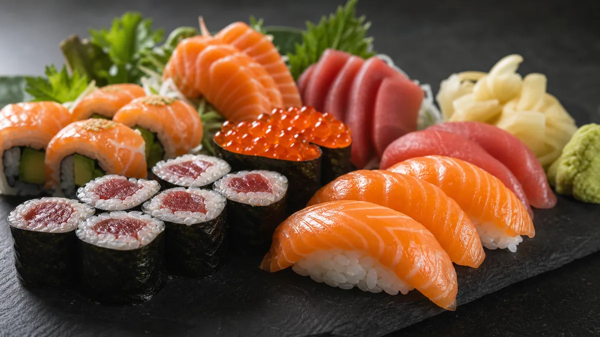
Angles that actually work
Pick one default angle per item type and stick to it. Consistency is the upgrade that makes a menu look designed.
| Item | Best angle | Why |
|---|---|---|
| Nigiri / rolls | 30–45° | Shows shape, height, and the shine on top of the fish |
| Sashimi slices | 30° or top-down | Reveals the fan layout and the cut texture |
| Poke / chirashi bowls | Top-down flat lay | Shows the full mix of ingredients and portion size |
| Full platters | Top-down or low 30° | Top-down for variety, low angle for a hero shot |
For platters where you want a premium, editorial feel, a dark surface with a low side light makes the colors pop without saturation tricks. Pair that look with the principles in our dark and moody food photography style guide when you want a signature look for hero images.
Shooting sets that sell the order
A single hero shot is not enough for sushi. Delivery customers are buying portion and variety, so your photos have to communicate how much and what comes in it.
- Shoot the full set so the count and arrangement are obvious.
- Include a single-piece close-up for menu detail shots.
- Keep portions honest — overstacking the plate creates the exact mismatch that drives refunds and bad reviews.
If you want a deeper system for the thumbnail itself, our delivery app thumbnail playbook covers crop-safe framing so your sushi still reads at small sizes.
Editing without making fish look fake
This is where most restaurants overcorrect. The goal of editing sushi is to fix the photo, not invent a new one. Honest enhancement means improving the lighting, evening the background, and recovering accurate color — never repainting the fish a brighter pink.
A phone-friendly enhancement pass should:
- Neutralize the white balance using the rice as a reference.
- Lift shadows slightly so the seaweed and underside of the fish keep detail.
- Recover highlights so glaze and roe glisten instead of blowing out.
- Clean the background to a smooth, neutral surface.
This is exactly the workflow FoodPhoto.ai is built for: you upload a real phone photo of the real dish and it fixes lighting, color, gloss, and background without changing the food. That honest-enhancement approach is what keeps your sushi looking premium and accurate at the same time — try it on one nigiri shot in the Menu Test Pack before you redo the whole menu.
A repeatable QA checklist before you publish
Run every sushi photo through this list:
- Rice is neutral white — not yellow, blue, or gray.
- No hard glare lines on fish, glaze, or seaweed.
- Fish color looks like the real thing, not boosted.
- Background is clean and consistent with the rest of the menu.
- Portion reads honestly at thumbnail size.
If all five pass, the photo is doing its job: it makes the food look as fresh as it actually is, and it sets an expectation the kitchen can meet.
Sushi rewards restraint. Shoot clean, keep the color honest, and let the freshness do the selling. When you are ready to bring an entire seafood menu up to one consistent standard, start with a single dish in the Menu Test Pack and check the pricing — a one-time $10 Menu Test Pack is enough to see what an accurate, premium-looking set does to your conversion.
Need consistent menu photos without a full reshoot? Start with real dish photos and improve lighting, background, and platform-ready crops in the FoodPhoto.ai studio.
FAQ
How do I photograph sushi on a phone without making the fish look fake?
Use one consistent light source, keep the rice neutral white, and avoid heavy saturation. Sushi looks most appetizing when the color is accurate, not boosted. Rotate the plate to control glare instead of editing it out, then enhance lighting and background rather than recoloring the fish.
Why does my sushi look green or yellow in photos?
Green and yellow casts come from mixed kitchen lighting — fluorescents and warm LEDs fighting each other. Turn off competing lights and shoot with one main source. If the rice reads neutral white, the fish color will read correctly too.
What angle is best for sushi and sashimi photos?
Use a 30–45 degree angle for nigiri and rolls to show shape and shine, and a top-down flat lay for full platters and poke bowls. Pick one default angle per item type and keep it consistent across the menu so the brand looks intentional.
How do I keep sushi rice from looking gray in delivery app thumbnails?
Gray rice usually means underexposure or heavy shadows. Add a white bounce card opposite your light, raise exposure slightly, and confirm the rice reads clean white before exporting. A neutral background also stops the rice from picking up a color tint.